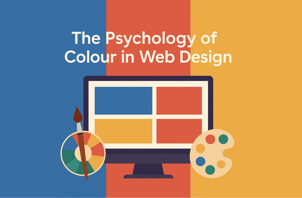
🧠 The Psychology of Colour in Web Design: What Works for Aussie Brands?
When it comes to building an impactful online presence, understanding the psychology of colour in web design is a game-changer. For Australian brands, the right use of colour can evoke emotions, influence decision-making, and build lasting brand loyalty.
In this blog, we’ll explore how colours affect users’ perceptions and which shades resonate best with Aussie audiences.
🎨 Why Colour Psychology Matters in Web Design
The psychology of colour in web design isn’t just about aesthetics—it’s about communication. Colours trigger emotional responses and can even affect users’ trust, conversion rates, and engagement levels.
According to Canva (source), 85% of shoppers say colour is the primary reason they buy a product. That statistic alone should be enough to make designers rethink their palette.
🇦🇺 Colours That Connect with Aussie Audiences
1. Blue – Trust and Reliability
Blue is commonly used in Australian financial and tech brands. Think of Commonwealth Bank or Telstra. It’s calming and dependable—perfect for gaining user trust.
2. Green – Nature and Sustainability
Aussies love the outdoors, and green represents eco-friendliness, which resonates with the local lifestyle. Sustainable brands and agriculture-based businesses benefit from using green.
3. Red – Passion and Urgency
Red captures attention quickly and is great for CTAs (Call to Actions). However, too much can feel aggressive. Use it sparingly for promotions or time-sensitive campaigns.
4. Yellow – Energy and Optimism
Perfect for targeting younger demographics, yellow evokes happiness and positivity. Australian lifestyle brands often use it to appear cheerful and modern.
5. Orange – Innovation and Creativity
A balance between red’s boldness and yellow’s cheer, orange is ideal for startups and creative agencies. It feels energetic without being overwhelming.
🛠 How to Choose the Right Colour for Your Brand
Choosing colours should be intentional. Here are some tips:
-
Know your audience: Different colours resonate with different demographics.
-
Stay consistent: Use your brand palette across your website, logo, and marketing materials.
-
Test performance: A/B test CTAs and landing page colours to see what converts better.
For a full brand identity redesign, check out our blog on 7 Signs Your Brand Identity Needs a Redesign in 2025.
🧩 Internal Colour Schemes That Work Well
| Industry | Colour Palette |
|---|---|
| Finance | Blue, Grey, White |
| Health & Wellness | Green, White, Light Blue |
| E-commerce | Red, Orange, Black |
| Travel & Lifestyle | Yellow, Aqua, White |
📈 Optimising for Conversions Using Colour
If you want users to click, sign up, or buy, then button and CTA colour choices matter. Psychology of colour in web design proves that:
-
Red or orange CTAs often perform best in e-commerce.
-
Blue buttons may improve form submission rates due to perceived safety.
🔗 External Resources Worth Checking
✅ Final Thoughts: Use Colour with Purpose
The psychology of colour in web design is a powerful tool, especially for brands trying to stand out in the competitive Australian market. By understanding emotional triggers and aligning colours with your brand message, you can improve user experience and conversions significantly.
Need help choosing the right colour strategy for your site? Contact Dolphinweb for expert design consulting.